The Mood Behind Colors
September 3, 2015, 7:15 pm
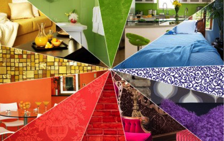
Colors impact people in different ways depending on past associations and how your brain processes those hues. The colors listed below includes the most common color and mood associations, so you can decorate based on how you’d like each room or area to feel. Various tones of the same color can also evoke different moods.
- Red
Red is typically associated with passion. Red can increase your heart rate and respiration. And while red can encourage warmth and passion, it can also raise feelings of intensity. This can be a good thing for a dining room where you hold lots of lively parties or in an office space where you need energy and drive. You can use red as an accent color for one wall or be bold and paint an entire room red. Red is also said to make people eat more—so for that big dinner party you’re planning, use red cloth napkins or a red table runner to ensure your guests really enjoy themselves and indulge. - Orange
Orange is associated with being active and social—perhaps that’s why you see a lot of workout clothing in shades of orange. In decorating, use a pop of orange in a living room, dining room, children’s room, or conference room to encourage more chit chat. - Yellow
It’s no surprise that cheerful yellow makes us feel happy—it’s the color associated with sunshine and many types of flowers. Yellow also make us feel optimistic. Pops of yellow are great for making people feel cheerful and even focused. Yellow is a great color for an office or to add light to any dimly-lit space like a hallway. But be careful not to use too much yellow. An all yellow room is said to increase anxiety and restlessness. Yellow also reflects the most amount of light, so avoid putting it on the wall where your television or computer sits as it can cause eye strain. - Green
Green reminds us of nature and is a rejuvenating color. Green is also associated with good health and healing. Green is also the color people are able to be around the longest without feeling overwhelmed. - Blue
Blue is calming. It’s the color of the sky and the ocean, so subconsciously it makes us think of serene environments. Blue is also said to lower blood pressure, and slow respiration and heart rate—making it a great color for a space where you practice yoga, sleep, or anywhere you want to unwind. Fun fact: Blue is so widely thought to be calming that in Glasgow, Scotland blue street lights were installed in hopes of lowering crime rates and suicide, and a number of other cities soon followed suit.
Sources: